Small Wonders 17.06.2017 – 17.09.2017
Aldo Bakker Studio designed the scenography for the exhibition Small Wonders about Late Gothic boxwood micro-carvings from the Netherlands in 2017. The exhibition, curated by Frits Scholten, displayed over 60 examples of miniature sculptures in the form of prayer beads, altarpieces, rosaries, statuettes and other types.
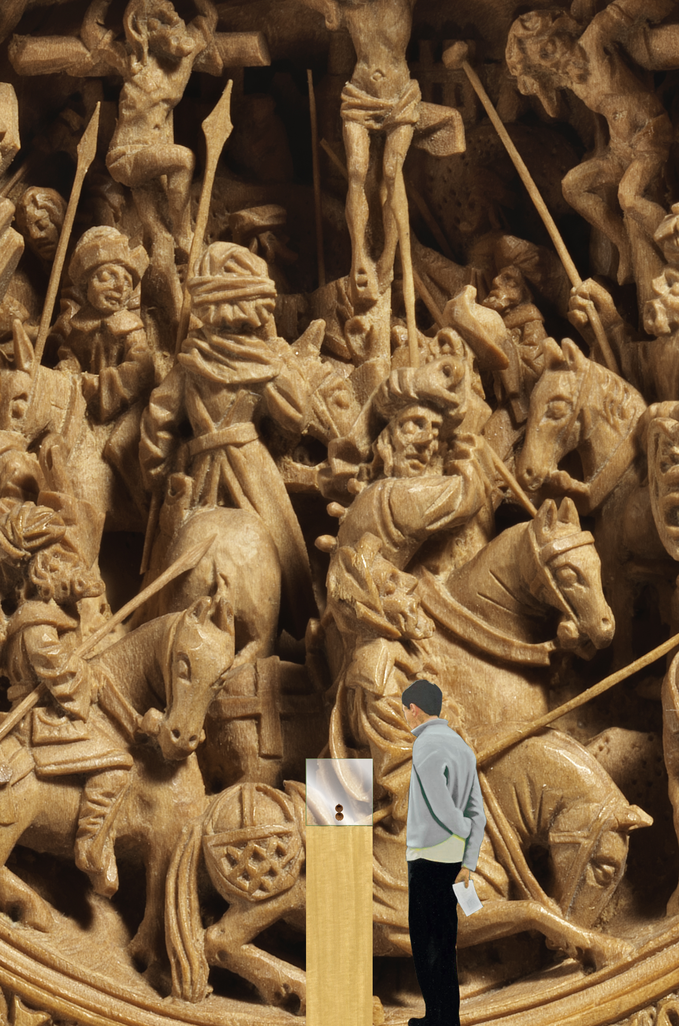
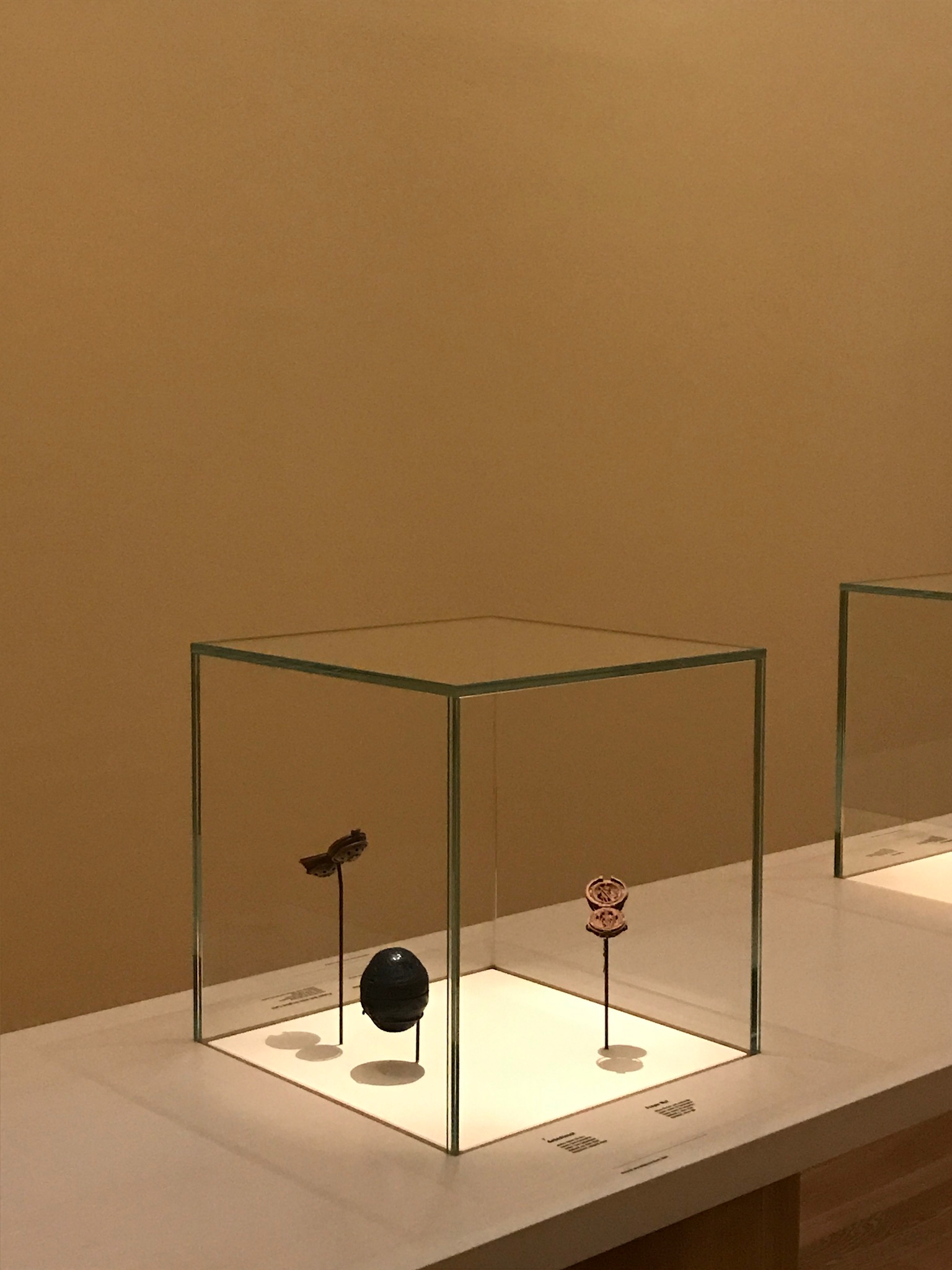
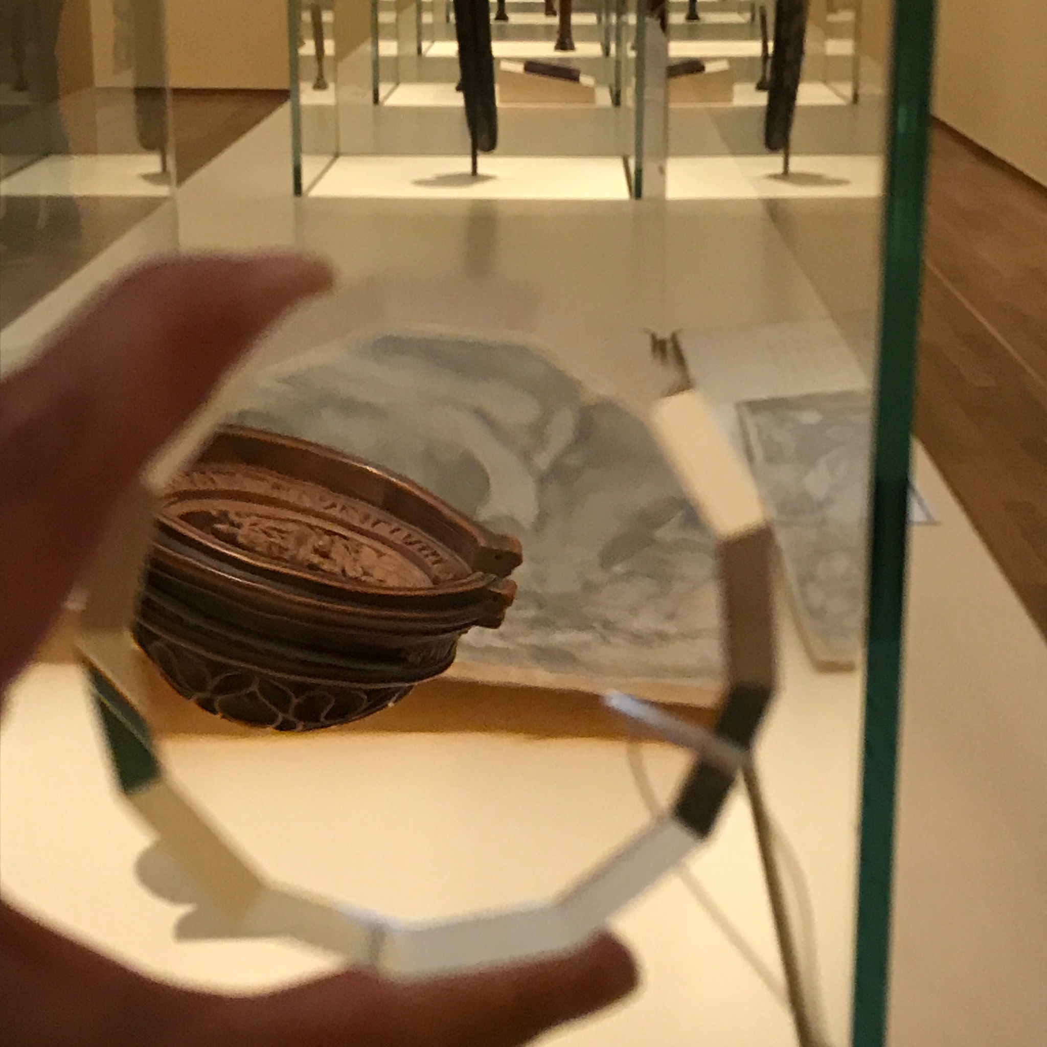
Besides the design of the overall scenography (the display cases, the pedestals, the colour scheme), several pieces of the Aldo Bakker Studio were incorporated in the exhibition. Lens could be used to enlarge the view of the minuscule delicate sculptures and Tri Angle provided a seat and a moment of rest.
Frits Scholten, head of sculpture at the Rijksmuseum, approached us to design the Small Wonders exhibition. We didn't know each other personally yet, but mutually we followed each other's work. He took us through his research, explaining and talking about the objects featuring in the exhibition.
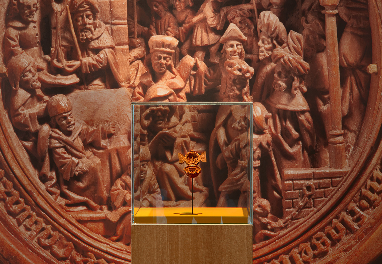
The gesture from big to small, coming one step closer and shifting our attention towards the details became the underlaying structure.
Observation
How can we properly convey this experience?
How can you get closer to really look at the objects without letting go of the conditions that protect the works?
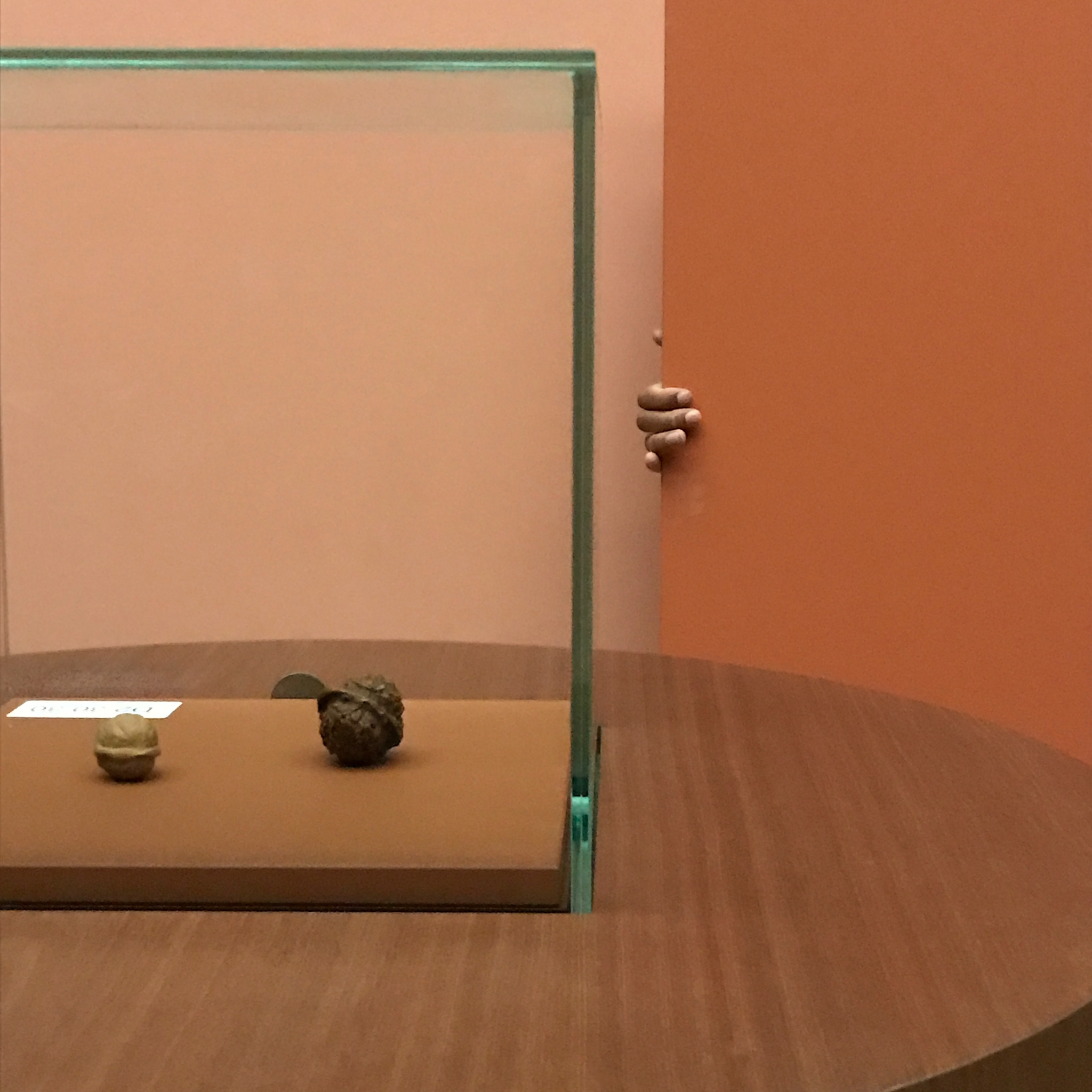
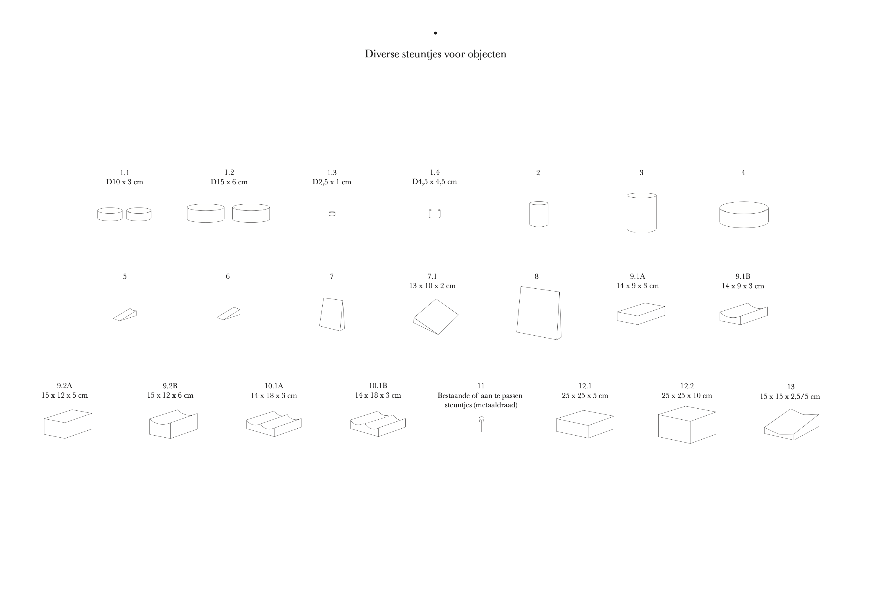
Frits Scholten had devised a dichotomy within the selection of works: Small portable objects and larger showpieces with a more permanent display. Each object was given its own position based on its own qualities. Each time the objects were placed and handled, the characters and specific qualities of the objects were taken into account. We created a setting, a condition in which the objects could be viewed with amazing detail, by inserting the possibility to look with and through lenses. Zooming in without entering the safe space of the objects.
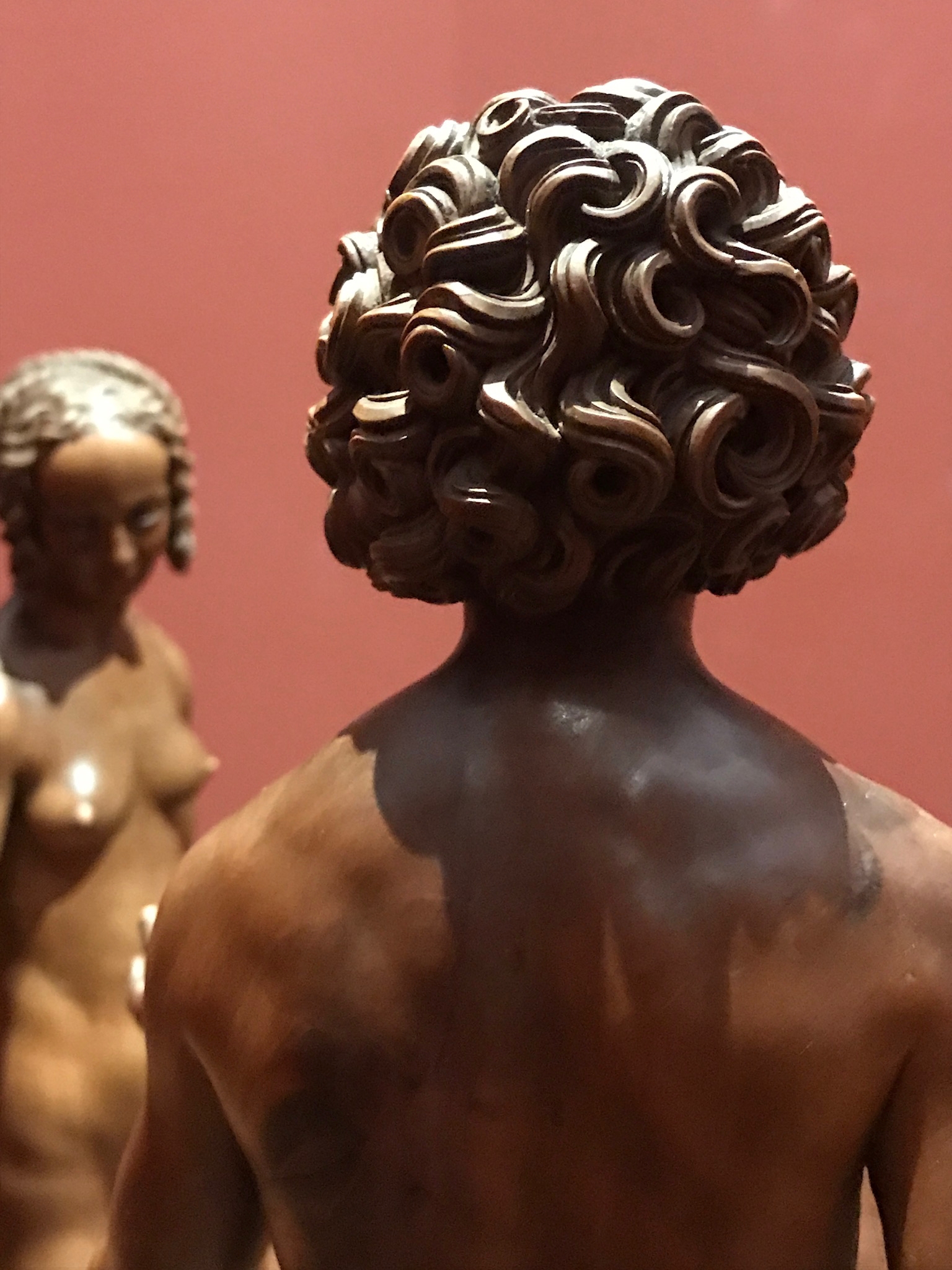
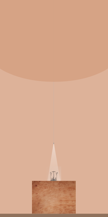
Another aspect was that the representations of these carved sculptures were very expressive, highly emotional even. We tried giving space to this expressiveness by placing them individually in combination with lighting to emphasize each objects character.
The colors in the halls came from the hues of the objects. Broadly speaking, there was a gradient from dark on the walls, along the floor and pedestal to lighter and lighter coming closer to the object.
